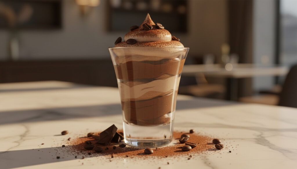
Pantone Color of the Year – 2025 Mocha Mousse Revealed
Pantone has designated Pantone 17-1230 Mocha Mousse as the Color of the Year for 2025, selecting a warming, rich brown hue that responds to global uncertainty. The announcement marks the 26th anniversary of the Pantone Color of the Year program, which began in 2000 as a cultural barometer expressed through color.
The selection reflects a collective yearning for comfort and authenticity. According to the Global Peace Index 2024, the world recorded 56 active conflicts—the highest number since World War II—with 97 countries experiencing decreased peacefulness. Mocha Mousse emerges as a visual counterpoint to this turbulence, offering what Pantone describes as a grounding, stabilizing presence.
Unlike the playful optimism of 2024’s Peach Fuzz, Mocha Mousse introduces a deeper, more sophisticated palette. The color functions as a genderless, practical neutral found in nature, designed to foster harmony across fashion, interior design, and digital interfaces.
What is the Pantone Color of the Year 2025?
Mocha Mousse
Peach Fuzz
Viva Magenta
Grounding Neutrals
- Mocha Mousse carries the Pantone designation 17-1230, representing a warm brown tone evocative of whipped chocolate.
- The 2025 selection responds directly to 56 active global conflicts recorded in 2024, addressing a universal need for stability.
- Unlike previous selections, this color functions as a foundational neutral suitable for both digital and physical applications.
- Pantone’s global team selected the hue after analyzing art collections, travel destinations, and emerging social values.
- The color encourages design themes centered on authenticity, connection, and belonging.
- Applications span furniture, textiles, packaging, and architectural elements.
- This marks the 26th iteration of the annual program that began with Cerulean Blue in 2000.
| Year | Color Name | Pantone Code | Central Theme |
|---|---|---|---|
| 2025 | Mocha Mousse | 17-1230 | Harmony amid uncertainty |
| 2024 | Peach Fuzz | Not specified | Optimism and comfort |
| 2023 | Viva Magenta | Not specified | Vibrant energy |
| 2022 | Very Peri | Not specified | Periwinkle innovation |
| 2021 | Ultimate Gray + Illuminating | Not specified | Resilience and hope |
| 2020 | Classic Blue | Not specified | Calm and stability |
How Does Pantone Select the Color of the Year?
The Selection Process
Pantone’s selection methodology involves a global team operating as “color anthropologists,” according to Pantone Color Institute Vice President Laurie Pressman. The team monitors new technologies, social values, art collections, and travel destinations throughout the year. They assess the overall mood experienced by designers and consumers before identifying which color families are bubbling up across all design disciplines.
Global Influences and Cultural Analysis
The 2025 selection specifically addressed the Global Peace Index findings. With 97 countries showing decreased peacefulness, the team identified a collective psychological need for grounding. This data-driven approach connects geopolitical events directly to chromatic choices, ensuring the Color of the Year reflects actual societal conditions rather than arbitrary aesthetic preferences.
Pantone’s team functions as color anthropologists, identifying emerging color families across fashion, architecture, and digital media before drilling down to a single representative hue.
What Is the History of Pantone Colors of the Year?
Key Past Selections
The program launched in 2000 with Cerulean Blue, symbolizing hope for the new millennium. Notable milestones include 2009’s Mimosa, which provided optimism during financial uncertainty, and 2016’s dual selection of Rose Quartz and Serenity, which addressed gender fluidity and societal shifts. Each selection creates a timestamp of cultural priorities.
Evolution of the Program
Over 26 years, the program has shifted from symbolic optimism to complex social commentary. Recent selections like 2024’s Peach Fuzz offered soft, playful warmth, while 2025’s Mocha Mousse suggests a maturation of this comfort narrative toward resilience and sophistication. The tradition now serves as an annual psychological benchmark.
How to Use the Pantone Color of the Year?
Applications in Design and Fashion
Mocha Mousse’s versatility allows integration across multiple disciplines. In fashion, the genderless neutral complements both muted and vibrant palettes. Interior designers utilize it for furniture and textiles to create warmth. Graphic designers employ the hue in packaging and branding to signal authenticity and honesty. The color’s natural foundation makes it suitable for architectural elements and digital interfaces alike.
Marketing and Brand Strategy
Brands leverage the color to communicate themes of belonging and connection. For professionals developing corporate materials, from internal communications to client presentations, the hue provides a stabilizing backdrop. Resources like 16 Oz to Cups – Reliable Conversion Guide demonstrate the precision required in design specifications, while professional documents such as How to Write a Letter of Recommendation – Complete Guide with Examples reflect the authentic communication values that Mocha Mousse embodies. For detailed specifications, consult the Pantone Color of the Year 2025 resource page.
Mocha Mousse blends harmoniously with both muted earth tones and vibrant accent colors, enabling designers to create depth-focused palettes that maintain visual warmth.
While versatile, the color’s grounding effect may read as too subdued for brands requiring high-energy visual identities. Test against specific audience demographics before full implementation.
Timeline of Pantone Color of the Year Selections
- 2000: Cerulean Blue launches the tradition, symbolizing millennial hope and calm. Source: Architecture Psychology
- 2009: Mimosa emerges during economic uncertainty, offering optimism. Source: Columbia Omni Studio
- 2016: Rose Quartz and Serenity become the first dual-color selection, addressing gender fluidity. Source: Columbia Omni Studio
- 2020: Classic Blue provides calm during the global pandemic’s onset. Source: Columbia Omni Studio
- 2024: Peach Fuzz embodies playful optimism and the desire for coziness. Source: Architecture Psychology
- 2025: Mocha Mousse marks the 26th anniversary, responding to record global conflict levels with a grounding neutral. Source: Wikipedia
What Information Is Confirmed and What Remains Unclear?
| Established Facts | Uncertain or Pending Details |
|---|---|
|
|
What Does the Pantone Color of the Year Represent?
The Pantone Color of the Year functions as a cultural translation mechanism, converting geopolitical and social conditions into a “silent language of color.” Created to engage consumers with how world events manifest aesthetically, the program serves as an annual psychological snapshot. Mocha Mousse specifically captures a societal pivot toward resilience and earnest authenticity in the face of measured instability.
The color’s genderless, foundational quality positions it as an honest neutral—one that rejects fleeting trends in favor of enduring presence. This reflects broader consumer movements toward sustainability and long-term value, moving beyond seasonal fashion cycles to establish lasting visual comfort.
Expert Insights and Source Attribution
“The team functions like color anthropologists, identifying color families bubbling up across all design areas before drilling down to the final selection.”
— Laurie Pressman, Pantone Color Institute Vice President, TIME
“The need for harmony.”
— Leatrice Eiseman, Pantone Color Institute Executive Director, TIME
Summary of Pantone’s 2025 Announcement
Pantone 17-1230 Mocha Mousse emerges as the 2025 Color of the Year, offering a grounding brown neutral that responds to unprecedented global uncertainty. Selected by a global team analyzing art, technology, and social values, the color provides designers with a versatile foundation for expressing authenticity and connection. From fashion runways to digital interfaces, this 26th iteration of the program demonstrates color’s capacity to reflect and potentially soothe societal turbulence.
Frequently Asked Questions
What was the Pantone Color of the Year 2024?
Peach Fuzz, a soft, vibrant hue embodying optimism and the desire for comfort and coziness. It preceded Mocha Mousse in the comfort narrative.
When is the Pantone Color of the Year announced?
Typically announced in December. The 2025 selection was revealed in December 2024, marking the 26th anniversary of the program which began in 2000.
What is the hex code for Pantone Color of the Year 2025?
The specific hexadecimal value for Mocha Mousse (17-1230) has not been provided in the official announcement materials.
How does Pantone choose the Color of the Year?
A global team analyzes technologies, social values, art collections, and travel destinations, operating as color anthropologists to identify emerging color families.
What does Mocha Mousse represent?
The color reflects society’s need for harmony, grounding, and authenticity amid global uncertainty and conflict.
More related posts
 New Nintendo Switch Games 2026: What’s Coming & Worth Playing
 How Does Starlink Work? Costs and Downsides
 NASCAR Schedule This Weekend – No Races April 11-13 2026
 Roblox Steal a Brainrot: Guide, Safety, Hacks & Codes
 Shinobi: Art of Vengeance Review & Comparison – Is It Worth It
 What Is a Cover Letter? Definition, Content, and How to Write One
 Silver Price Today: Current Spot Price & Market Update
 Grocery Store Near Me Open Now: Irish Supermarkets Guide